
Meet Astro, the household robot with Alexa.
Overview The Amazon Astro household robot is a Day 1 Editions product. The landing page was outdated and needed a revamp to be on par with the new Amazon design system and framework.
As part of Amazon Devices Brand Studio, I collaborated with the Astro marketing team to redesign the user experience & interface design on the Astro robot landing page website.
My role focused on ideating, rapid conceptualization and design. I worked on defining and transforming complex ideas into high-fidelity prototypes.
Role UX/UI Designer
Disciplines user experience and interface design, motion, visual design
Tools Figma, Photohop, After Effects, Smartsheet, Quip
Timeline 2022 - 2023
Goals
1. Clarity: Make key feature information understandable to non-technical users
2. Usability: Improve user experience navigation
3. Responsiveness: scalable to any screen sizes
4. Engagement: Increase interaction with the astro features
Target audience An exclusive invite only customers who live on a single floor home.
Challenge Amazon Devices had recently updated their CMS software MAKO to a new CMS software called Journeys. The landing page needed to improve accessibility, cognitive load, and user experience.
The Astro Product/Marketing team needed the product page to be accessible and easy to manage any content or copy needs without the assistance of a designer.

Design Process
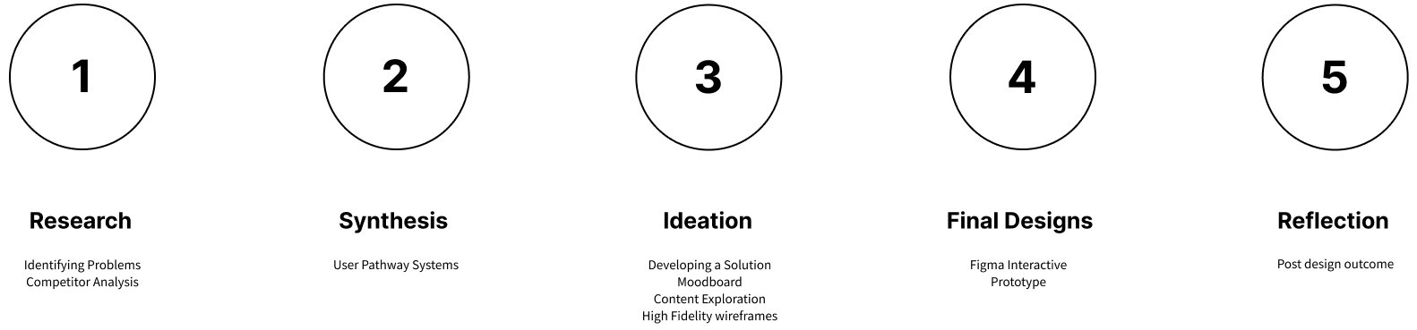

Ideation
Content Pack Exploration
Here are some of my initial thought processes regarding research and the goals for the Astro product landing page. The Content Pack options provided my initial exploration ideas of content grid packs, layout, icon usage and pathway movements.

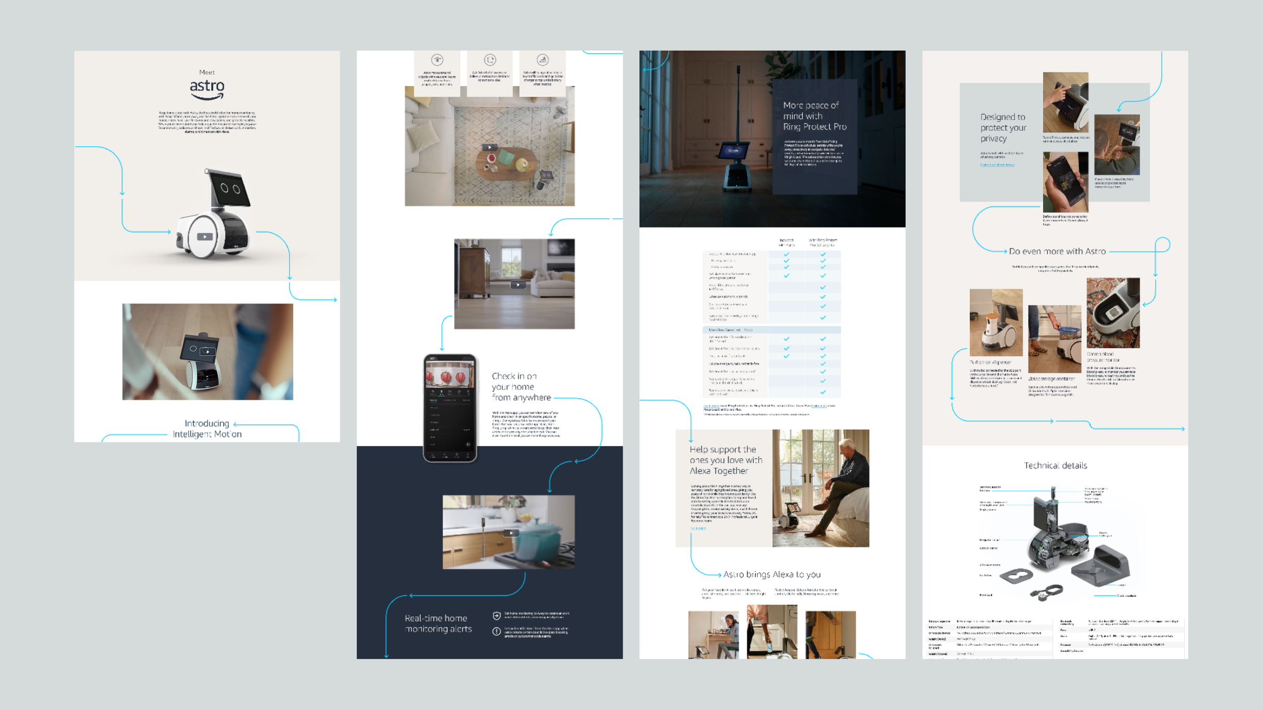
Final Designs
Figma Interactive Prototype
The refresh Astro product landing page now features updated content pack, typography, layout and pathways system line style that bring the design in line with current Astro design system and adheres to accessibility. Key product details are more prominent, creating a page that’s not just visually appealing but also manageable for stakeholders to use. Finding information and taking action is now seamless, thanks to improved user experience.
Reflection
Post design outcome
The launched of the new Astro product landing page was a success. Everyone from Stakeholders to the brand studio team were stoke and thrilled to see the Amazon & Astro branding showcasing on the updated Astro product landing page.
The Astro product landing page was made for everyone. I deliver this landing page with accessibility in mind. I reduce the page length by 30%. Also user engagement increase by 25%.
There are still parts of the landing page where I would like to improve. For example I would have like to add a sticky navigation bar so customers can have a seamless scrolling while skipping to their desire section without leaving the page. This landing page also needed a text drop down menu to help reduce page length by 50%. These added features would help users experiences and also help reduce cognitive load.
Research
Identifying problems
The Amazon Astro product landing page lacked accessibility and overwhelm user cognitive on length of the page which leads to a bad user experience.
To address these challenges, I conducted user research, competitive analysis, and created multiple design iterations based on feedback from stakeholders and the brand studio team. The image below shows the length of the Astro product landing page and the old framework with its accessibility issues.
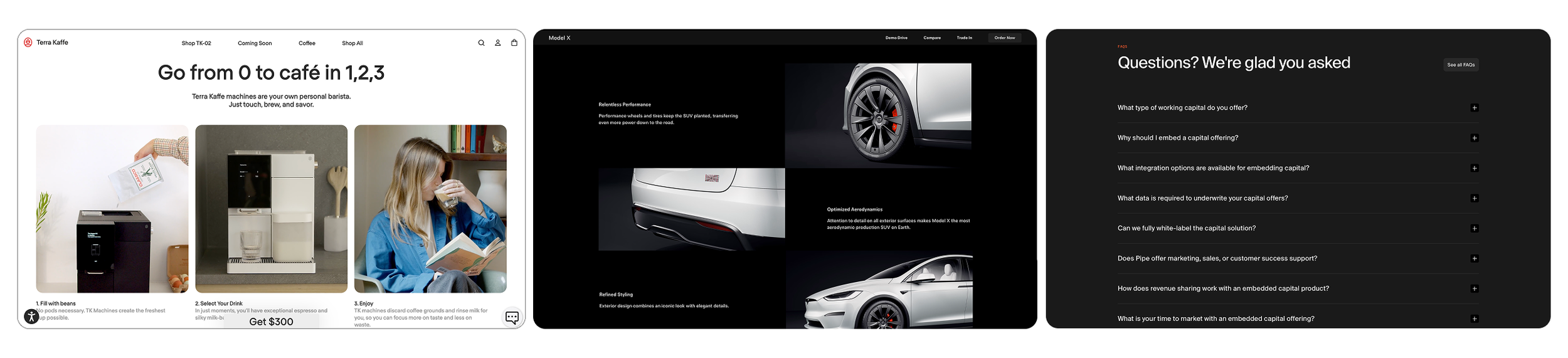
Research
Competitor analysis
I analyzed content sections from Terra Kaffe, Tesla, and Squareup to benchmark usability, tone, experience and visual clarity. This helps me to identify best practices and areas for differentiation.
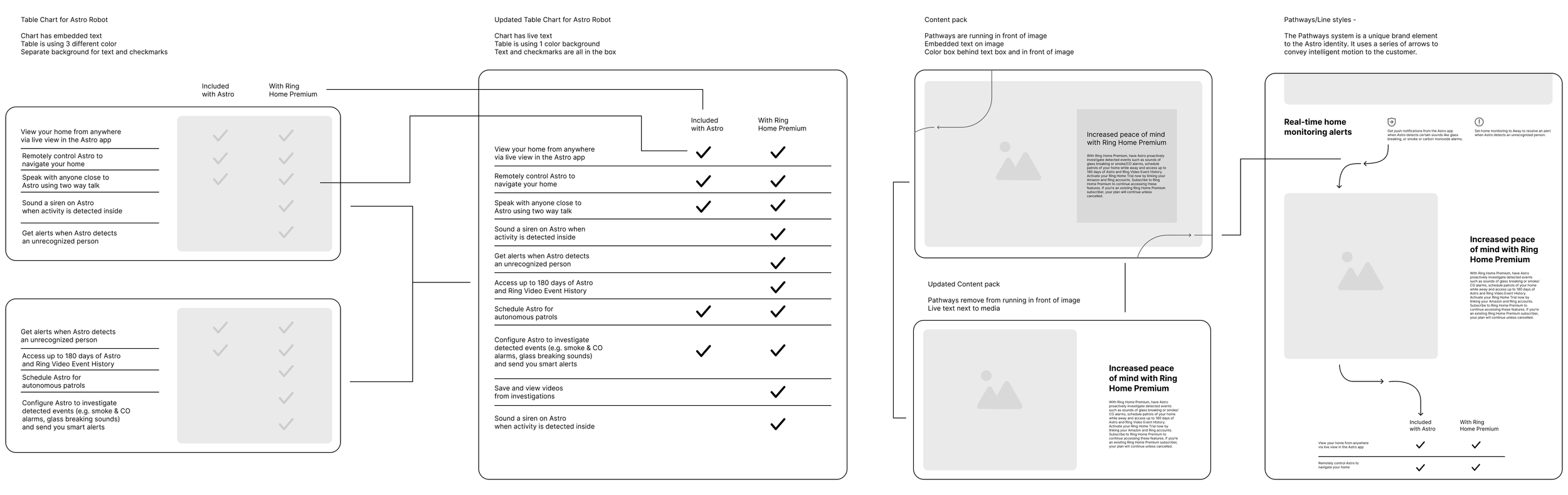
Synthesis
User Pathway systems
The Pathways system is a unique brand element to the Astro identity. It uses a
series of arrows to convey intelligent
motion to the customer. Paths shows the movement of Astro: fluid but still intentional, precise, and engineered.
Users follow the pathway on the landing page the same way Astro follows them around the house. The pathways line in the product page also guys user to the next content pack and to key information about the many features Astro has to offer.
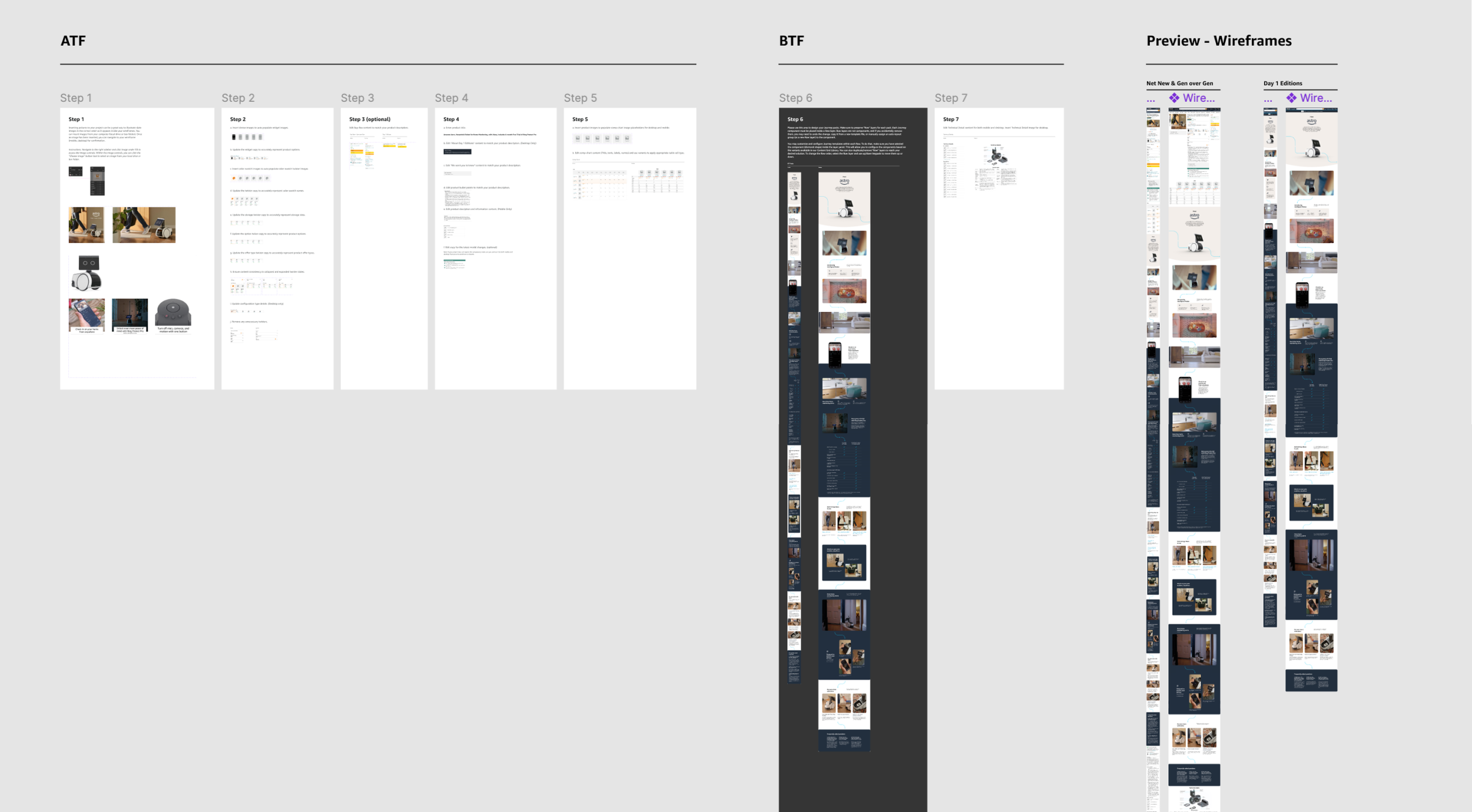
Ideation
Developing a Solution
I designed the Astro product landing page to be intuitive and with a clean user friendly interface, visual hierarchies, and CTA hyperlinks. By designing this page I made sure to guide users end to end experiences by adhering to design best practice principles.
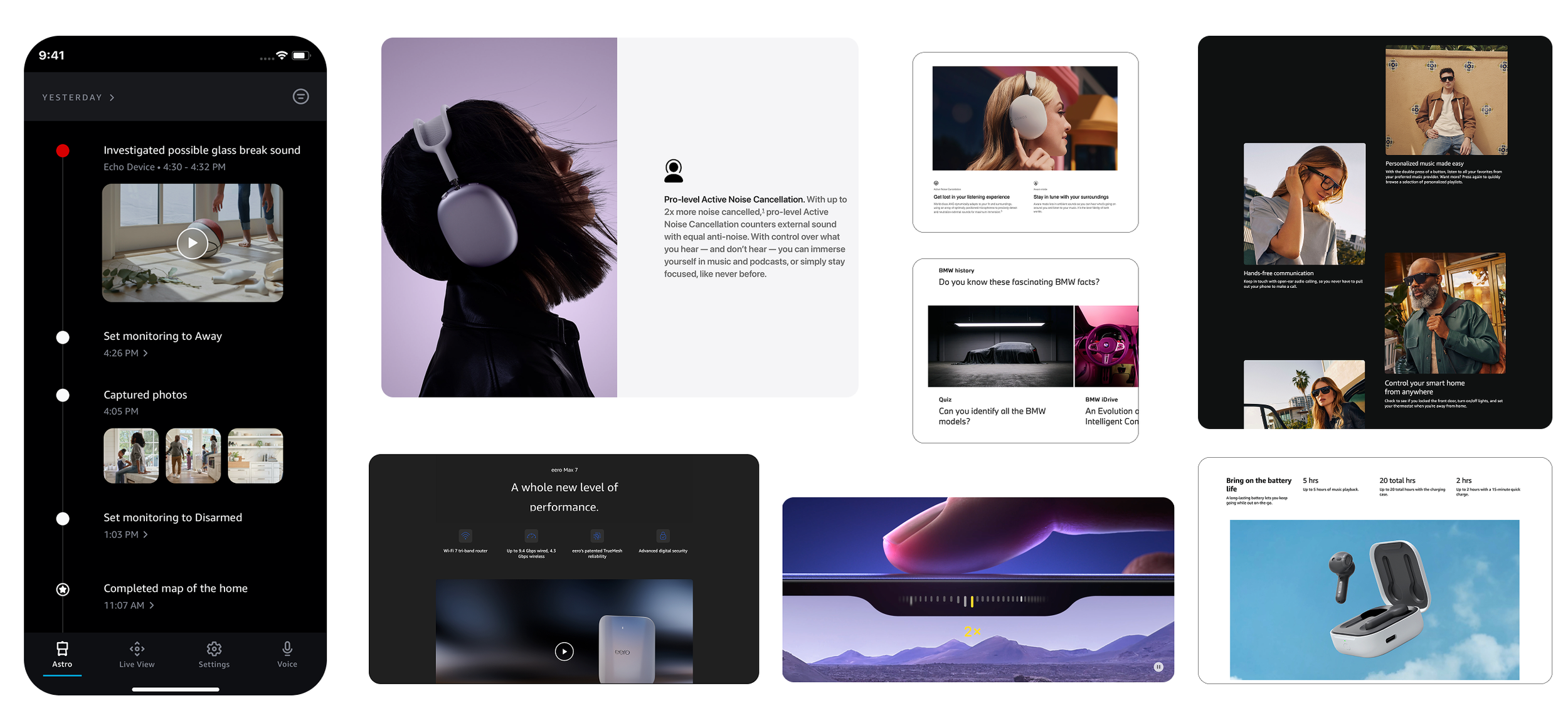
Ideation
Moodboard
I created a moodboard inspired by elements from the Amazon branding, Alexa design system, Astro app design, Alexa Carrera design, Apple design system, and BMW design. This board serves to guide the Astro product landing page design language and interactions, blending Amazon sleek interface standards with creative design styles.
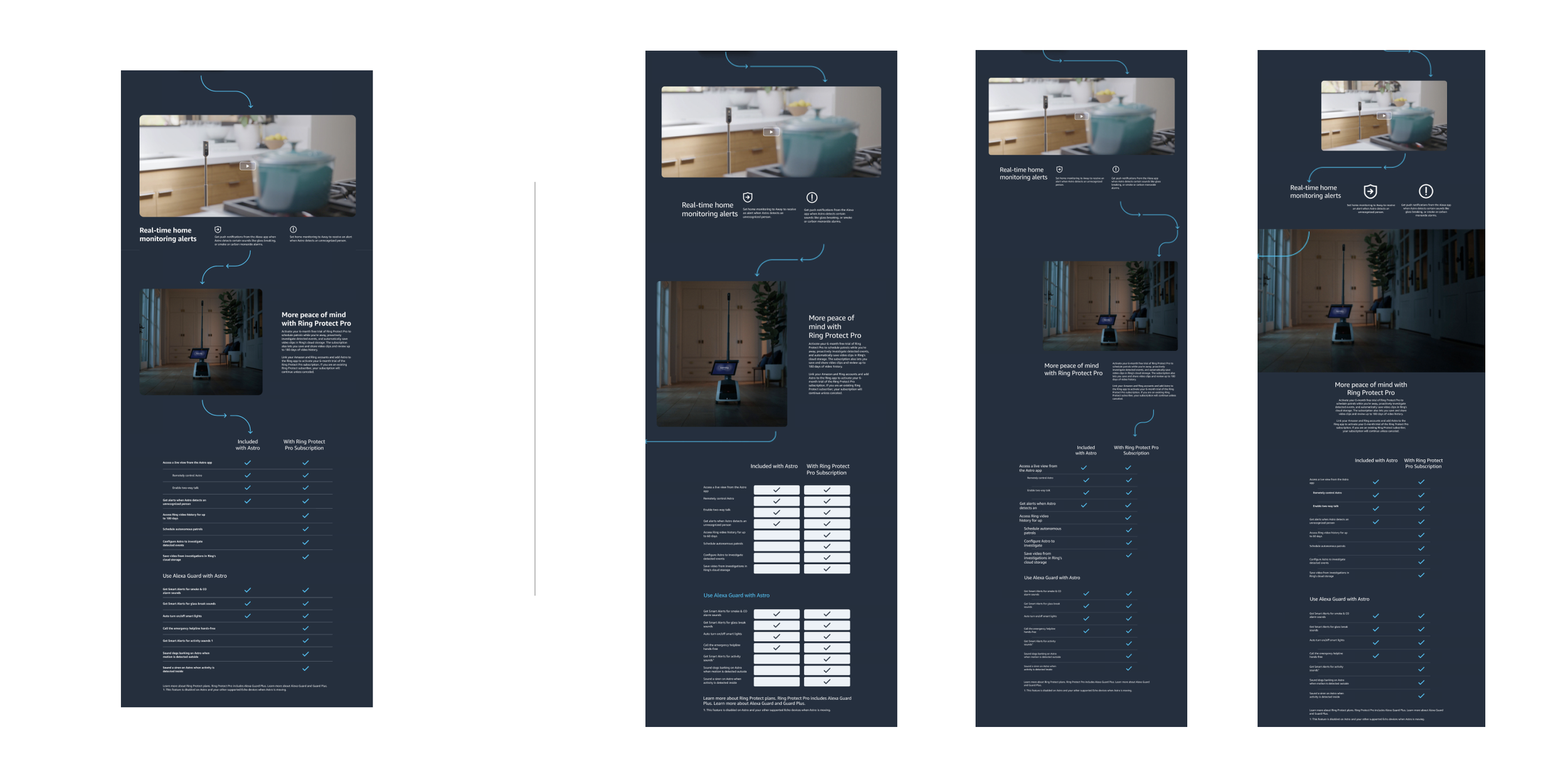
Ideation
High Fidelity wireframes
The high fidelity wireframe provides user with a welcoming and unique user experience. With a clean and clear visual hierarchy, applied Astro design system, and updated content pack.